In data visualization, a plot is a graphical representation of data that helps us interpret information quickly and effectively. By displaying values visually, plots make it easier to identify trends, relationships, and patterns that may not be immediately noticeable in raw datasets.
Plots come in various forms—such as scatter plots, line graphs, bar charts, histograms, and more. The choice of plot type depends on the nature of the data and the kind of insights we want to uncover. For example, a scatter plot is ideal for exploring the relationship between two variables, while a histogram helps visualize the distribution of a single variable.
Visualization is a crucial step in both data analysis and data communication. A well-designed plot not only makes complex information more accessible but also allows analysts to detect outliers, fluctuations, and structural patterns with ease.
In R programming, the plot() function serves as a versatile tool for creating a wide range of visualizations. It can be customized extensively to enhance the appearance and interpretability of graphs. Some useful arguments for styling and customizing plots include:
- pch – Controls the shape of the data points
- cex – Adjusts the size of the points in the plot
- colors() – Applies color schemes to enhance readability
- type – Defines the connectivity between points (e.g., points, lines, both)
- lty and lwd – Modify the line type and line width
Generating datasets a and b, and visualising the graph with the standard plot() syntax:
a = 1:10
b = runif(10,5,15)plot(a,b)
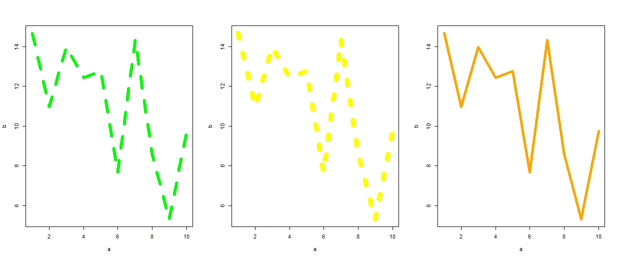
We can also plot multiple graphs within a single figure by using the "col" argument for different colours and customizing line types and widths with lty and lwd.
par(mfrow = c(1,3))
plot(a,b, type = 'l',col = "green", lwd = 6, lty = 2)
plot(a,b, type = 'l',col = "yellow", lwd = 10,lty=3)
plot(a,b, type = 'l',col = "orange", lwd = 5, lty=7)
 The line types and widths, along with the different colors of the data points, increase progressively as illustrated in the sequence above.
The shape and size of the data points can also be fully customized using the pch (plot characters) and cex arguments. The cex parameter controls the size of the points, where values range from 0.5 (50% smaller than the default size of 1) up to 2, making the points twice as large. The pch argument supports 25 distinct plotting symbols, as shown in the figure. The two example graphs clearly demonstrate how pch and cex influence the appearance of a plot and highlight their importance when using the plot() function.
par(mfrow = c(1,2))
plot(a,b, type = 'p',col = "blue",pch=11, cex=.5)
plot(a,b, type = 'p',col = "red",pch=23, cex=2)
In this example, multiple colors and plot characters are used to clearly distinguish each set of data points.
plot(a,b, type = 'p',col = c("red", "violet","black"),pch=c(14,15,16), cex=2)
We can define a title for the plot using the main argument, and label the x-axis and y-axis with the xlab and ylab arguments within the plot() function.
plot(a,b, type = 'p',col = "red",pch=23, cex=2, main = "Example plot", xlab = "x-axis", ylab = "y-axis")
The different plot types, displayed with various colors, are shown in the image to provide a clearer and more intuitive understanding.
par(mfrow = c(2,3))
plot(a,b, type = 'b',col = "violet",pch=23, cex=2, main = "Type - b")
plot(a,b, type = 'h',col = "black",pch=23, cex=2, main = "Type - h")
plot(a,b, type = 's',col = "brown",pch=23, cex=2, main = "Type - s")
plot(a,b, type = 'p',col = "red",pch=23, cex=2, main = "Type - p")
plot(a,b, type = 'c',col = "green",pch=23, cex=2, main = "Type - c")
plot(a,b, type = 'o',col = "green",pch=23, cex=2, main = "Type - o")
In conclusion, this article has demonstrated the use of the plot() function in R with source code and visual examples to clarify its key arguments. The examples provided serve as a foundation for understanding how each parameter shapes the final visualization. Since data visualization plays a crucial role in communicating insights, selecting the right plot type and appropriate arguments is essential for presenting information clearly and effectively.


Post a Comment
The more questions you ask, the more comprehensive the answer becomes. What would you like to know?